001
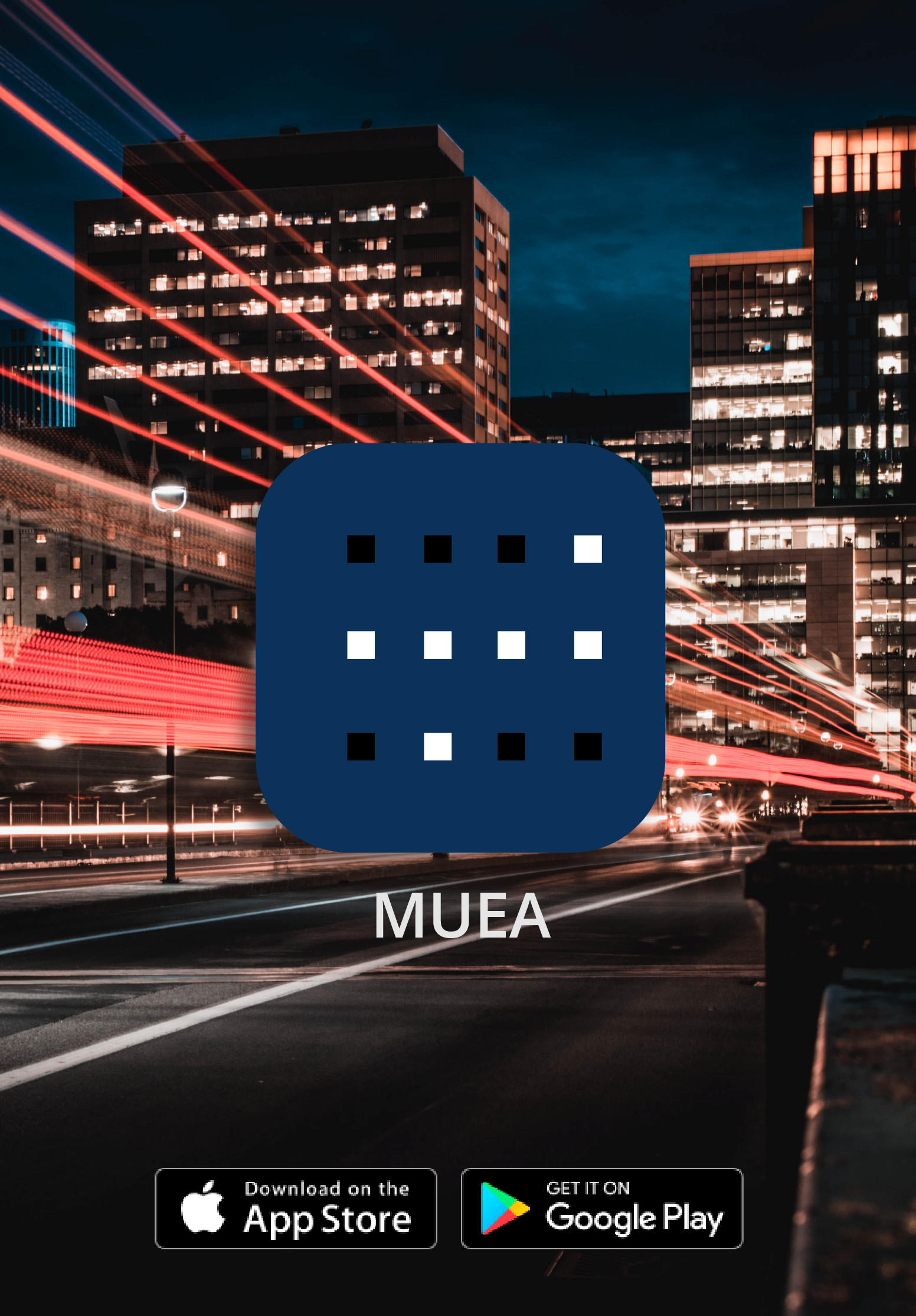
MUEA Application
Brand Visual Identity and Compettition application for energy compettition
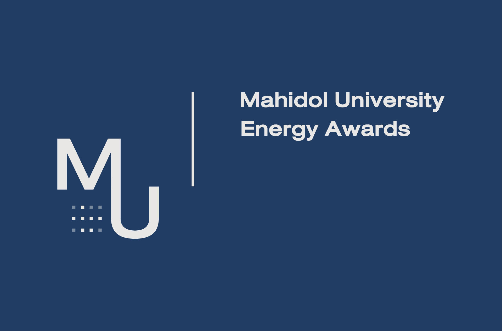
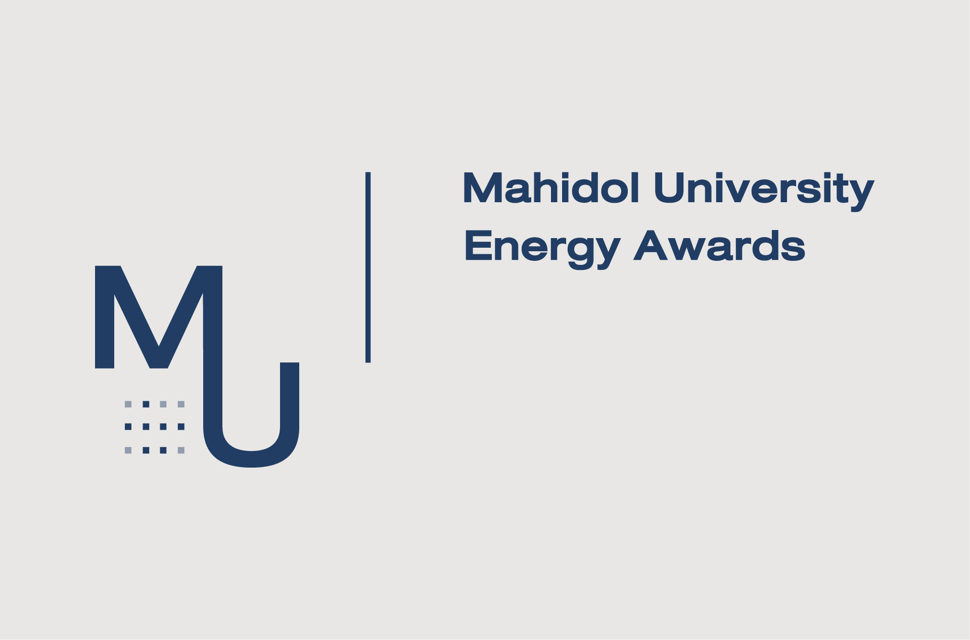
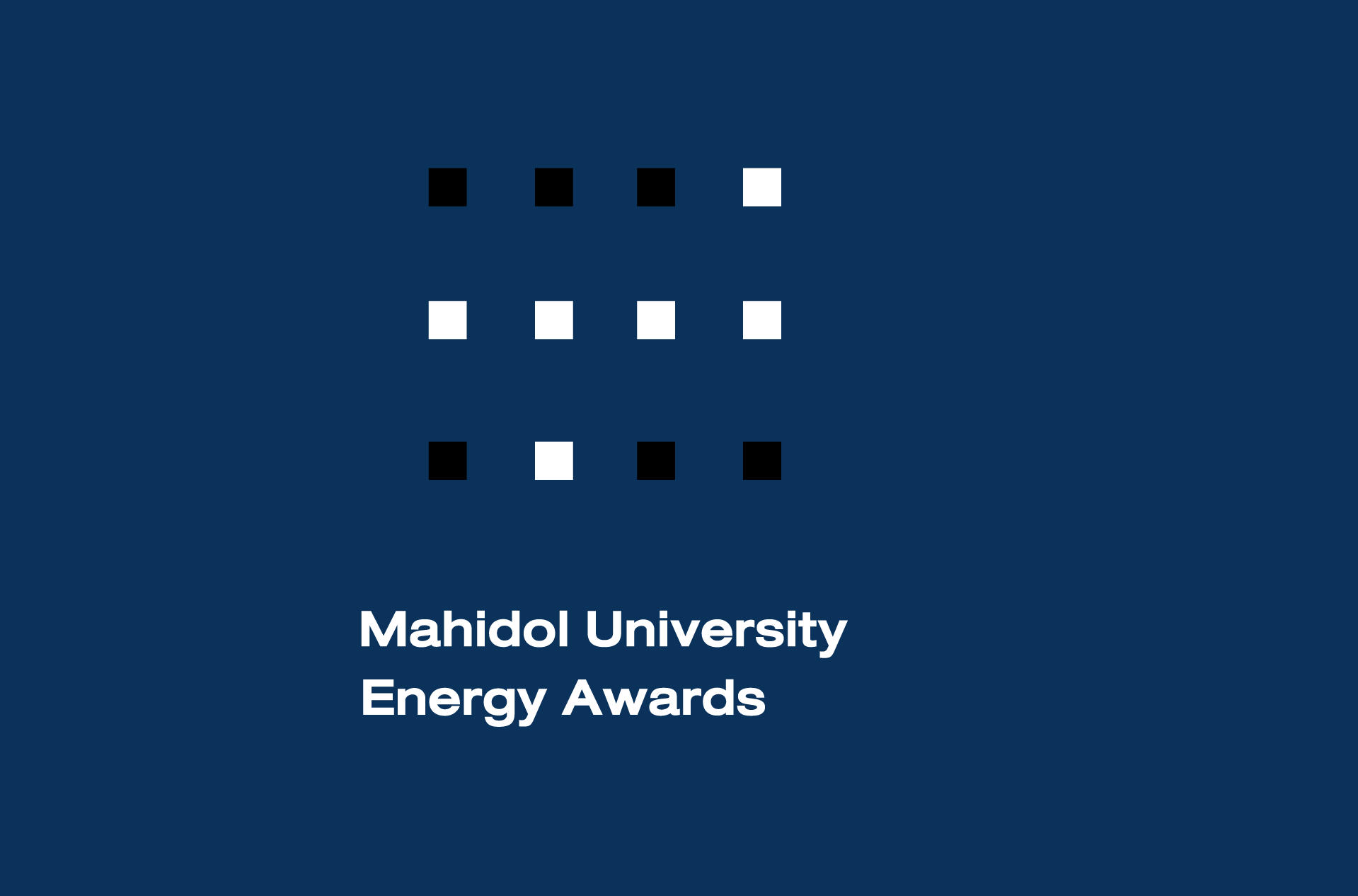
002 Corporate logo I.
003 Corporate logo II.
Details
The energy management competition's logo was designed in combination mark form following the meeting's consensus. The linkage of the abbreviation letters M and U represents the buildings in the university - 'U' is the buildings and 'M' their roofs, all under the same roof of M, Mahidol. In addition, there are windows in the buildings in which the lights have been turned on and off in the fashion of braille letters M and U to represent an organization for the visually impaired students of Mahidol University.
The windows in the buildings in which the lights have been turned on and off in the
fashion of braille letters M and U to represent an organization for the visually
impaired students of Mahidol University, being developed and using in application and small area.
004 Corporate logo III.
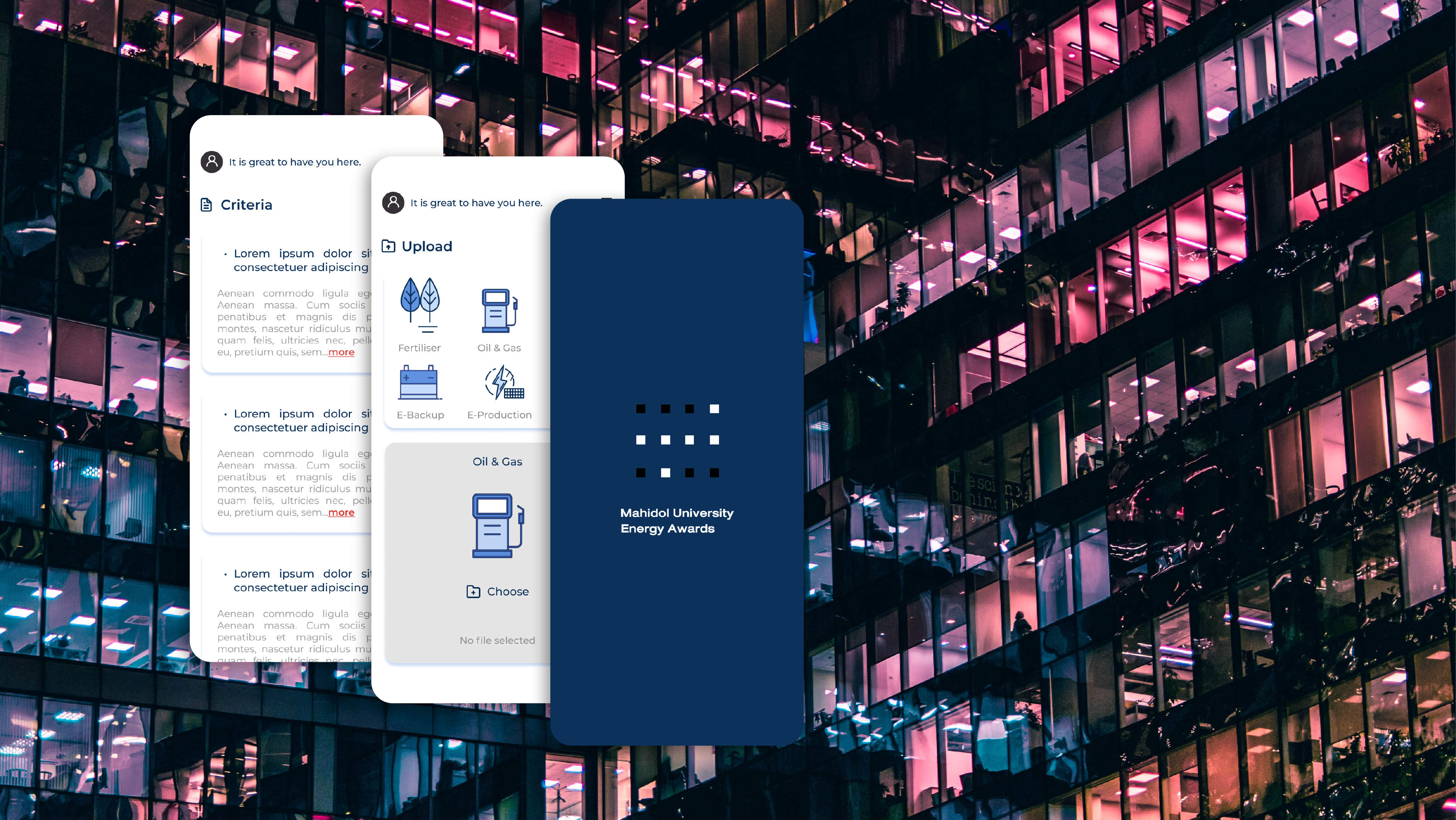
005 MUEA application
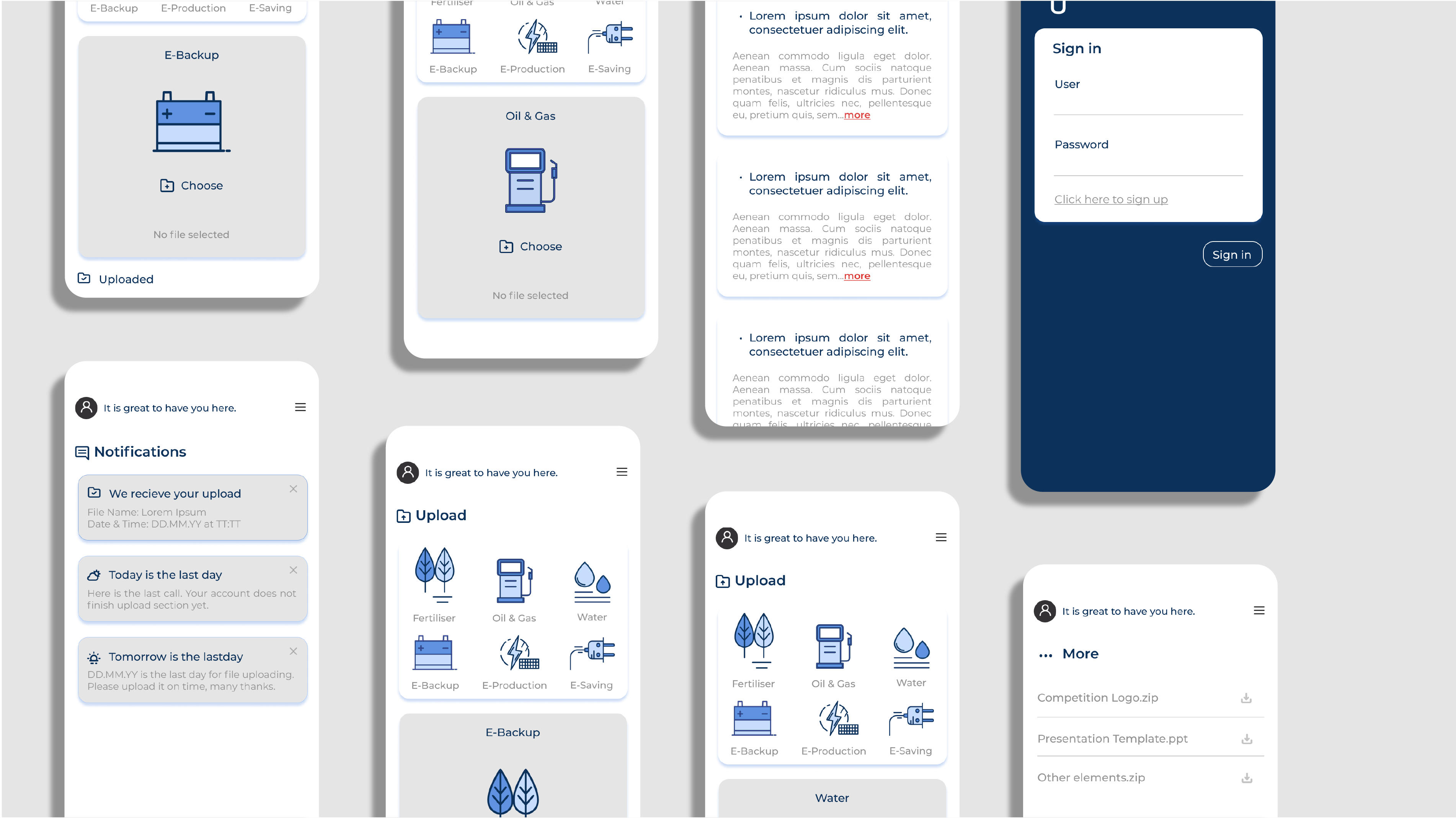
006 MUEA application overview
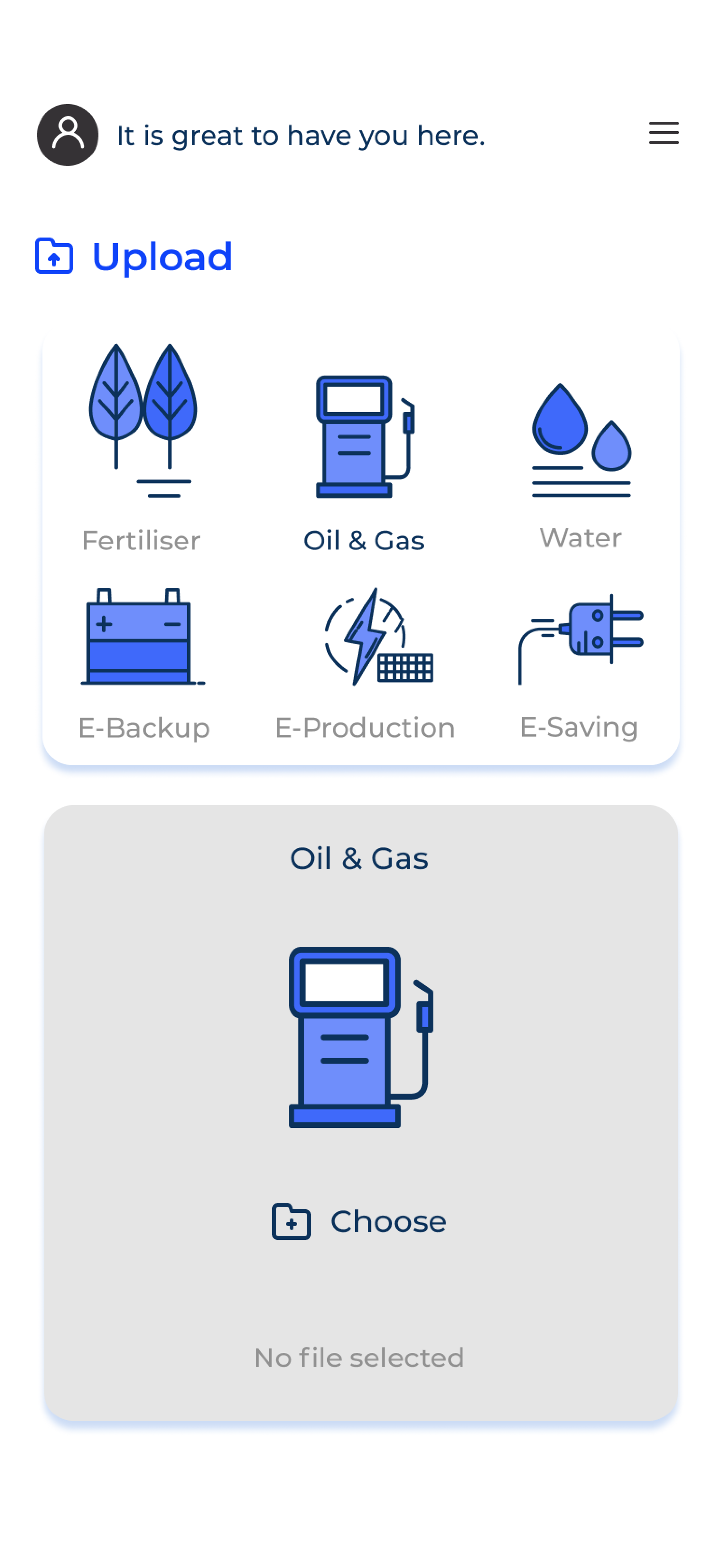
007 MUEA application mockup (phone)
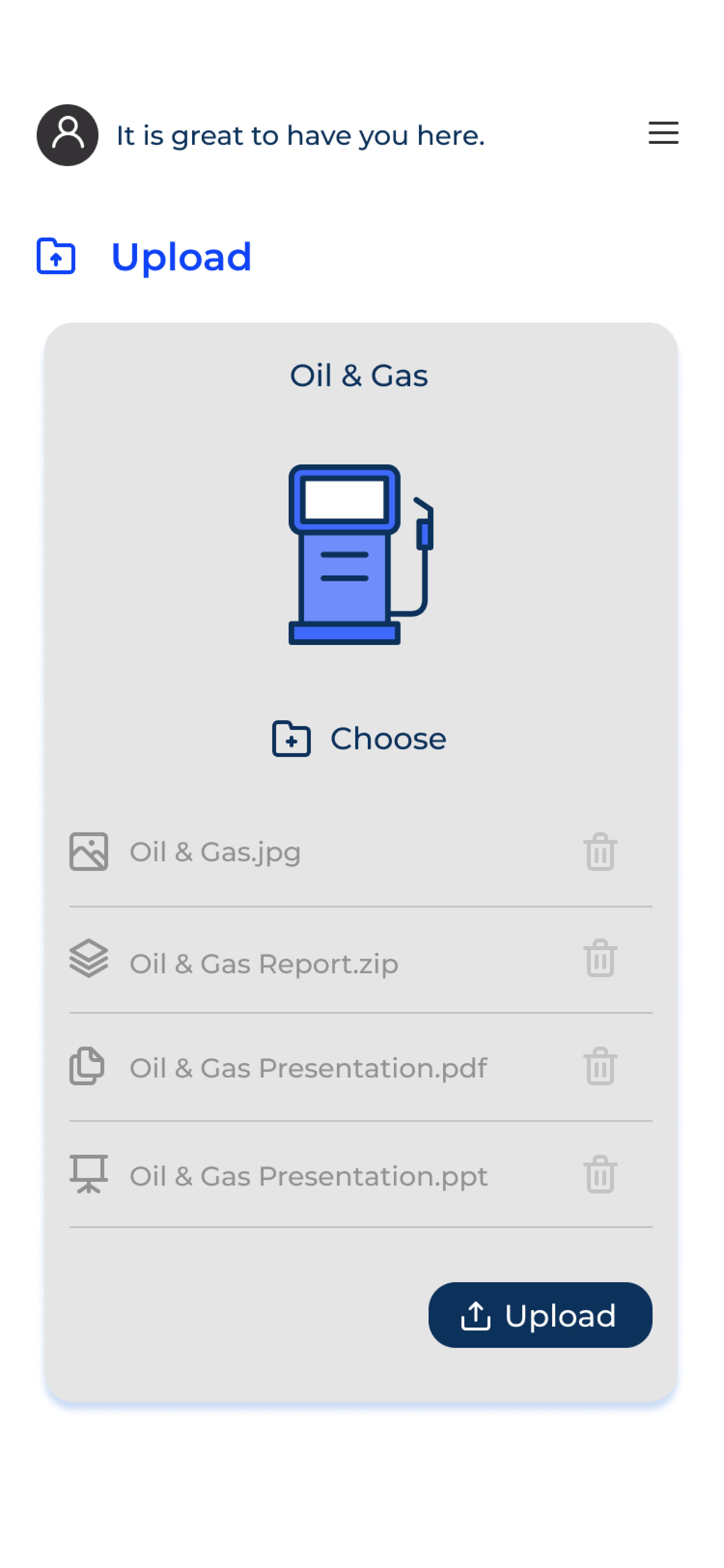
007 MUEA application mockup (phone)

007 MUEA application mockup (phone)
007 MUEA application mockup (phone)
Resources' Acknowledgements
- 001 Designed by Artmonkey / Freepik
- 002 Mike Kononov
- 003 Marc Olivier
- 004 Pexels-Tima Miroshnichenko
*** If there are any mistakes in 'Resources' Acknowledgements, please contact me. I will amend it
for you.***