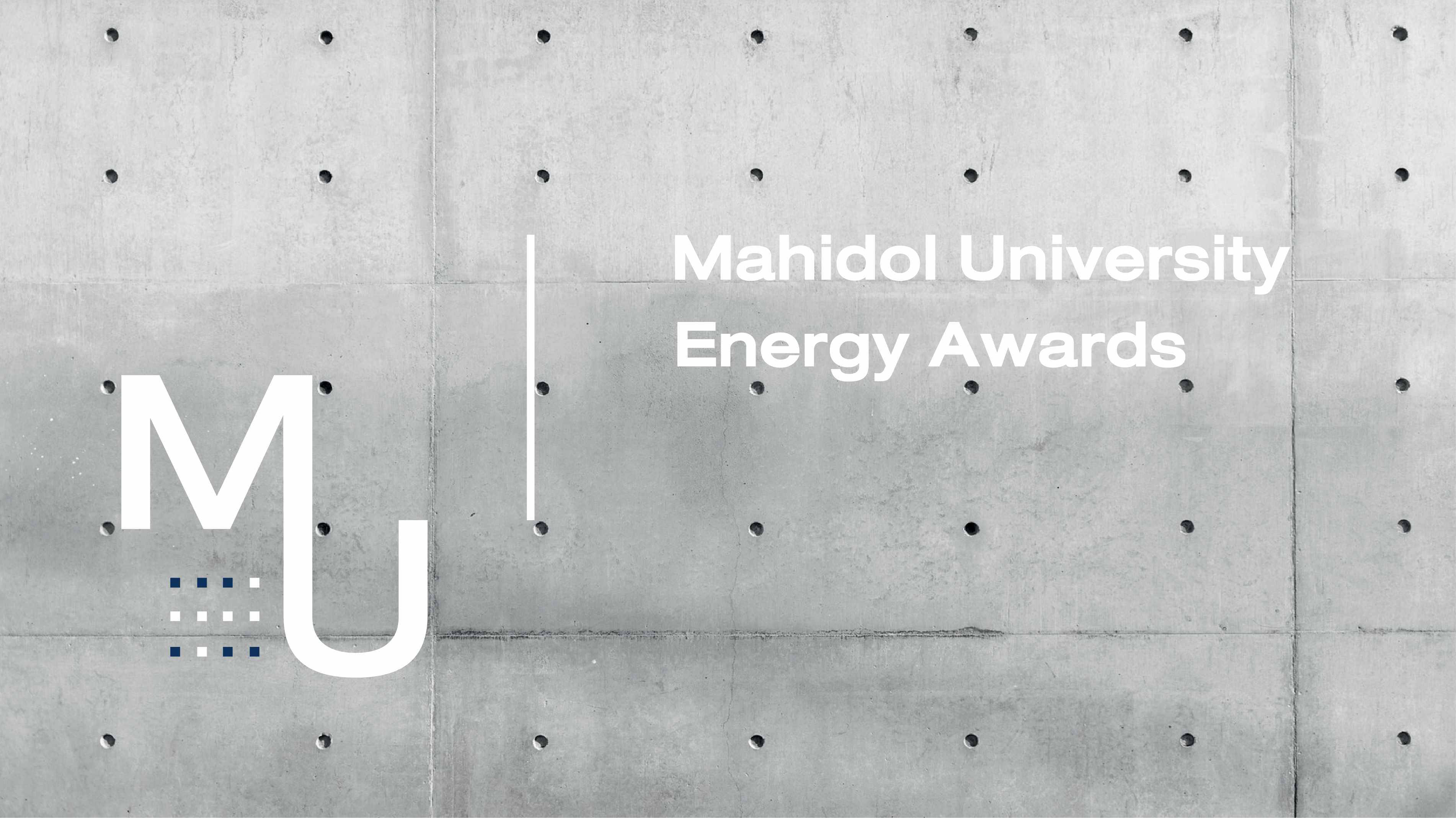
001 Mural
MUEA
Corporate Identity for Mahidol University's Energy Compettition
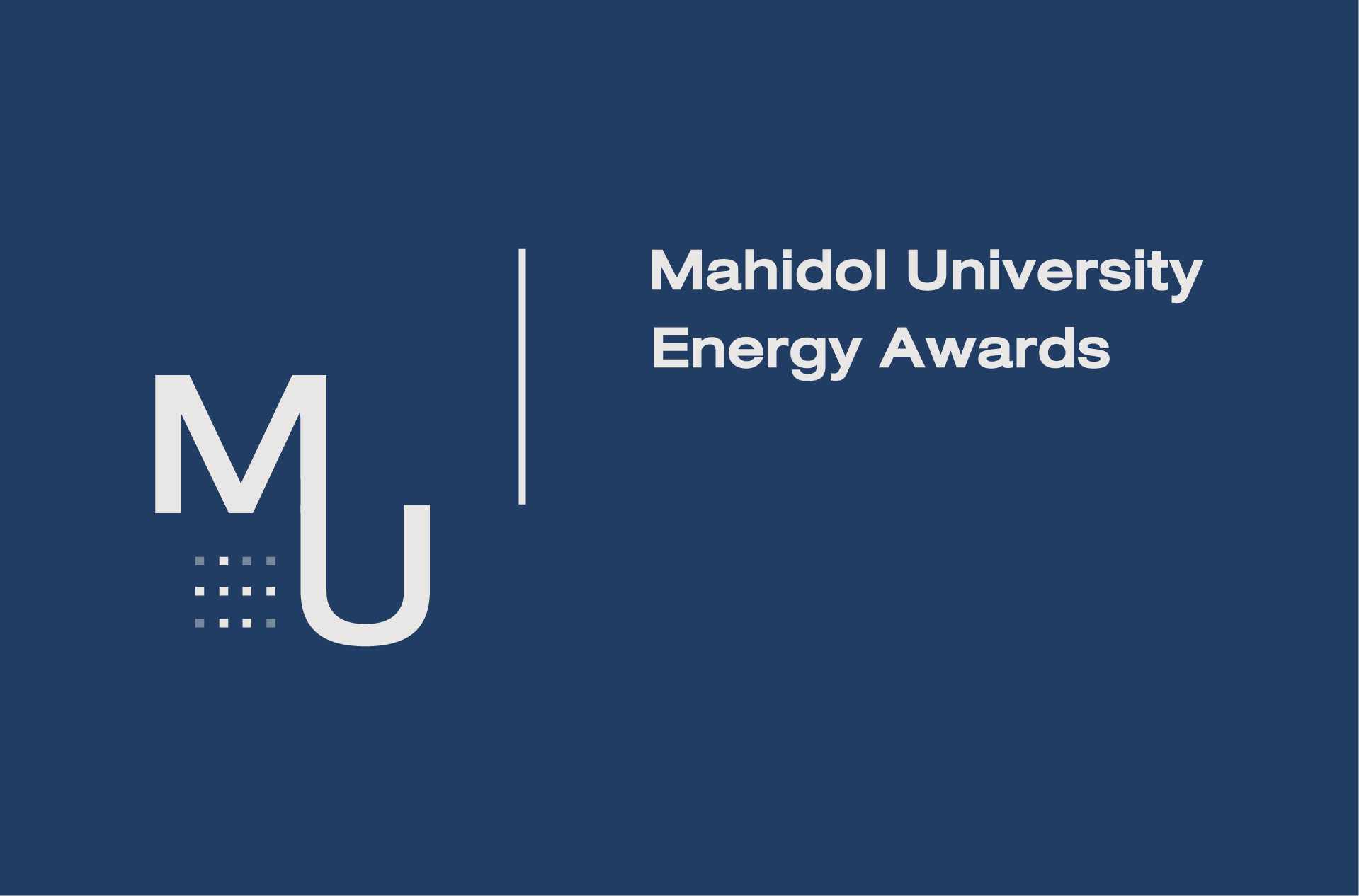
002 Corporate logo on dark background
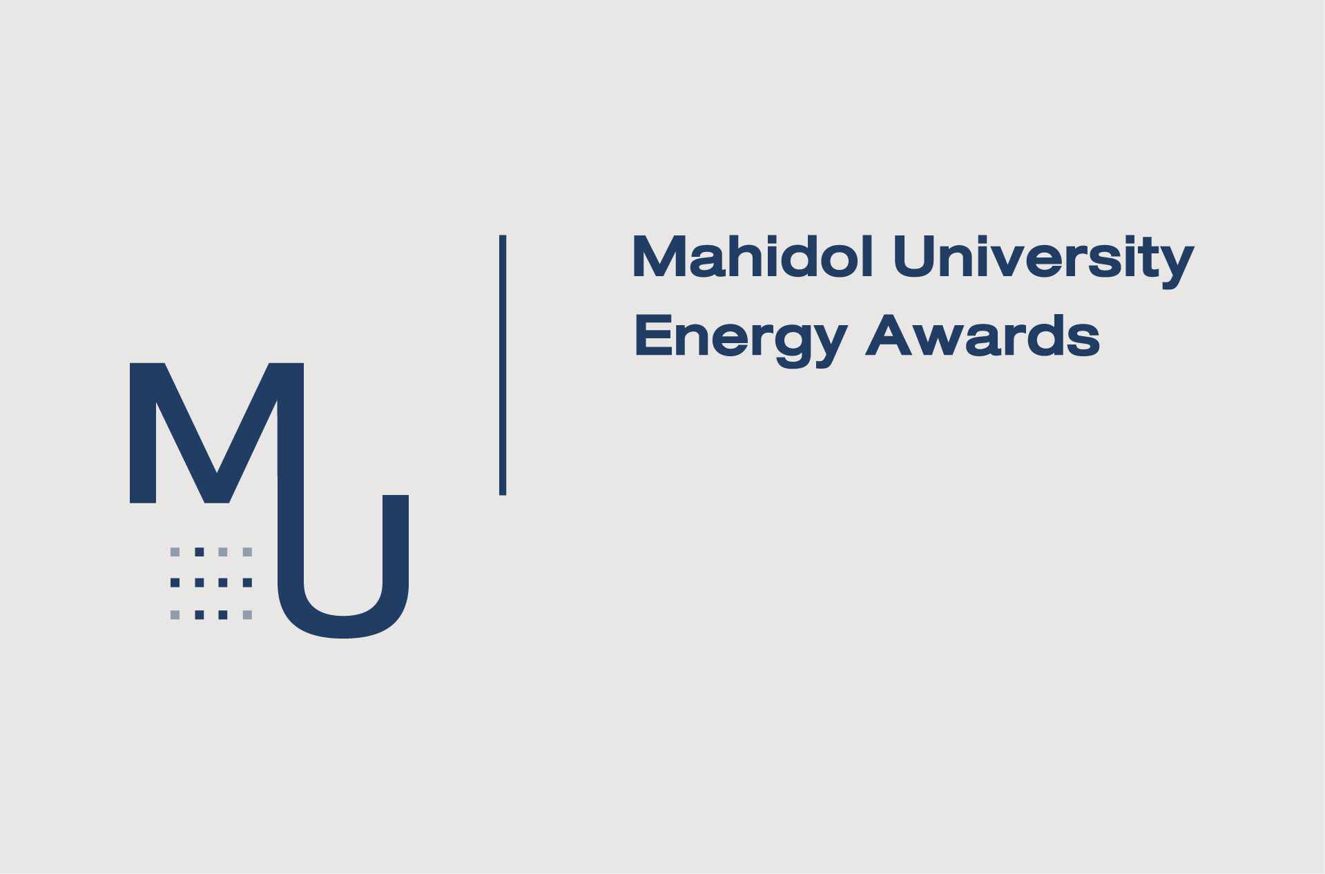
003 Corporate logo on light background
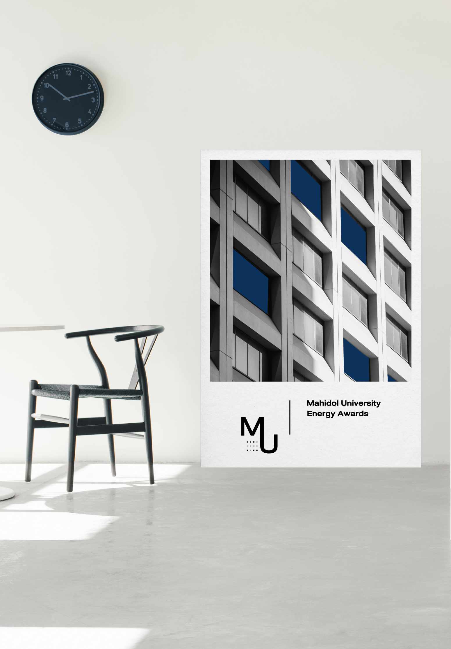
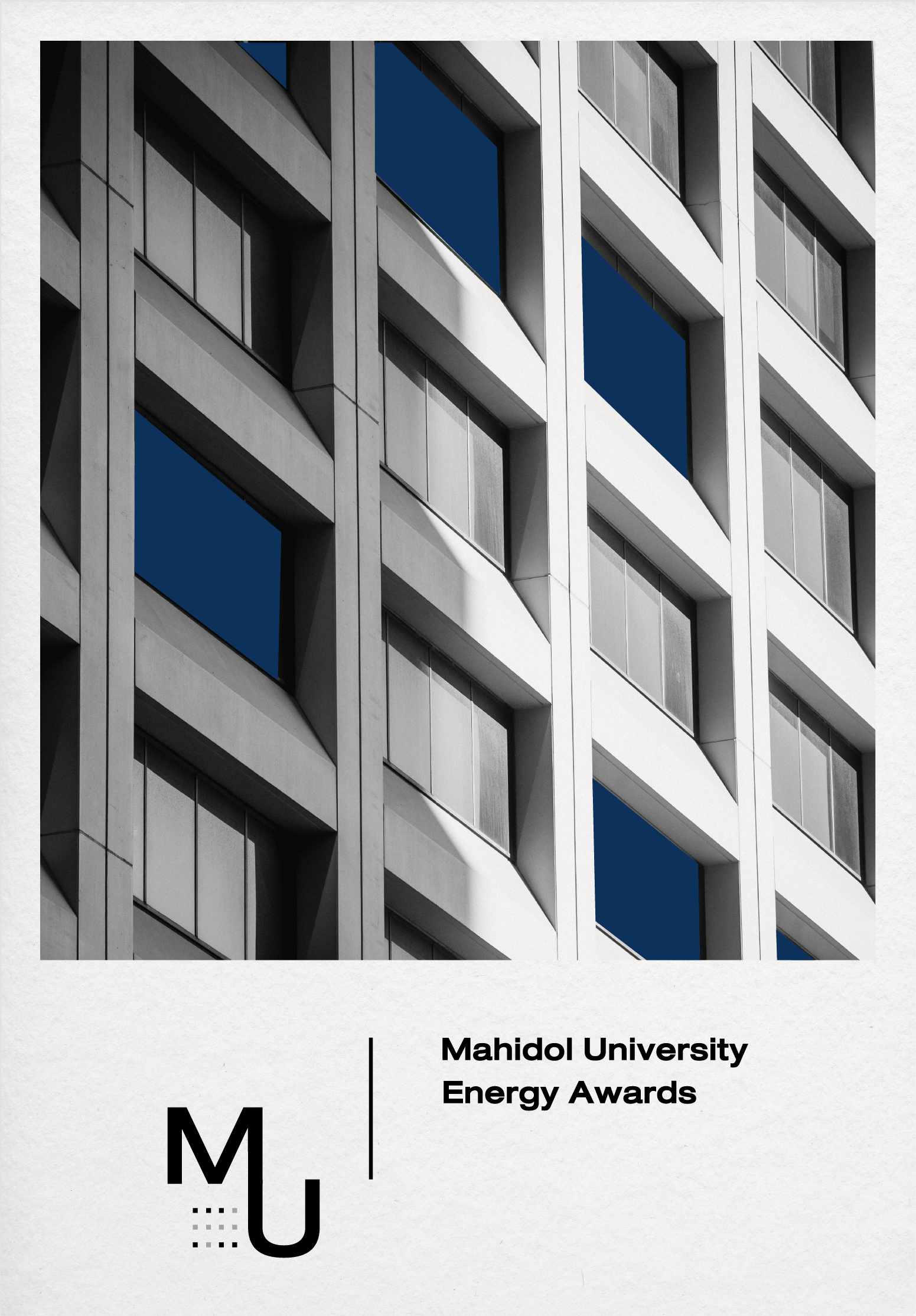
004 Poster/standee design
005 Poster/standee design
The Division of Physical Systems and Environment demanded the energy management
competition's logo to be valuable and remembered easily, whilst also be assuring and modern in look.
Details
The energy management competition's logo was designed in combination mark form following the meeting's consensus. The linkage of the abbreviation letters M and U represents the buildings in the university - 'U' is the buildings and 'M' their roofs, all under the same roof of M, Mahidol. In addition, there are windows in the buildings in which the lights have been turned on and off in the fashion of braille letters M and U to represent an organization for the visually impaired students of Mahidol University.
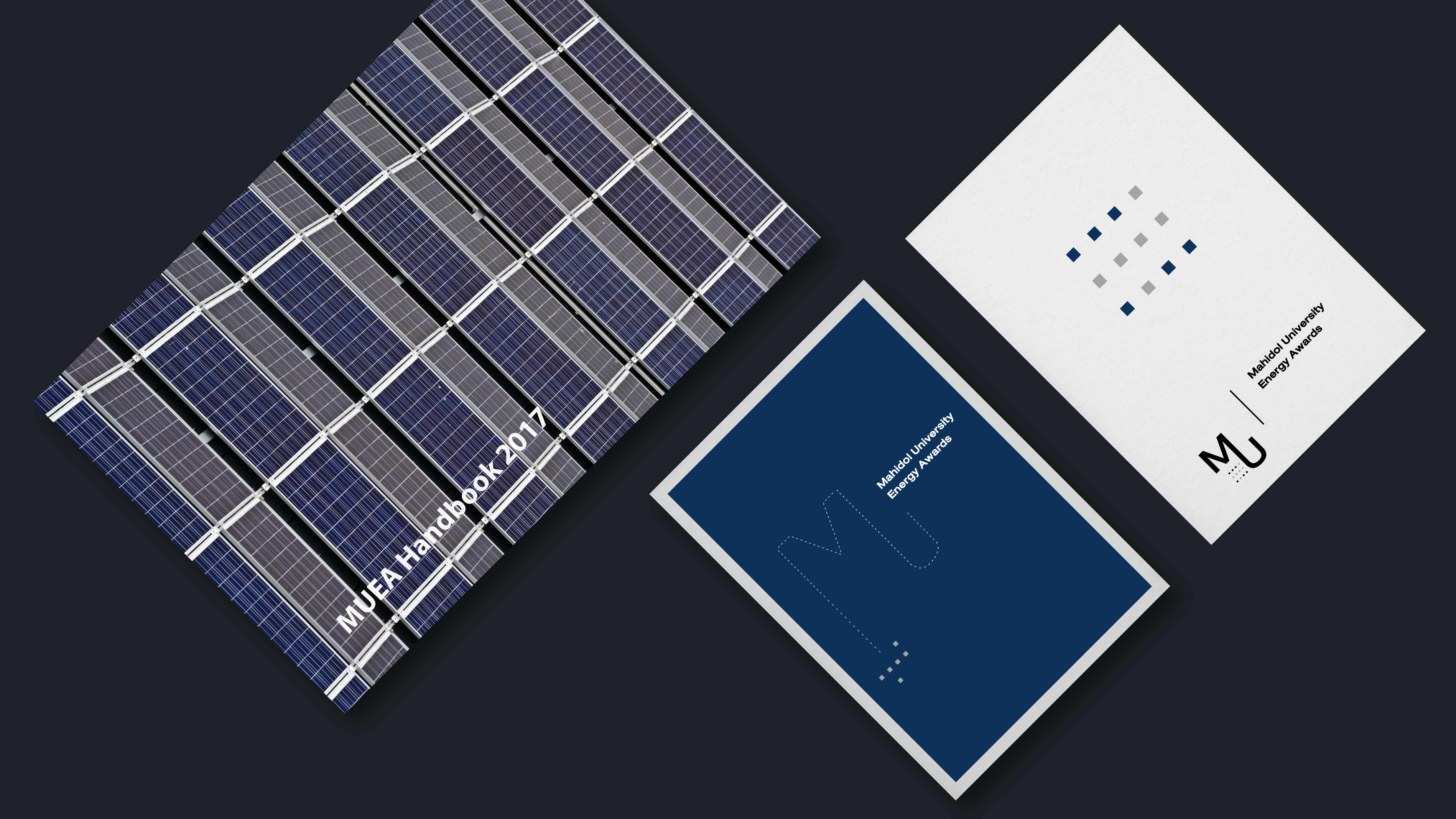
006 MUEA corporate identity
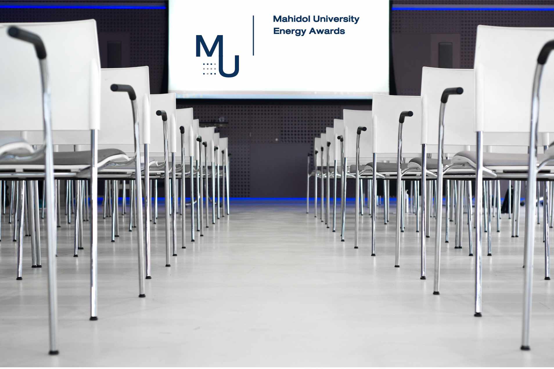
007 Conference atmosphere (mockup)
Resources' Acknowledgements
- 001 Bernard Hermant
- 002 Laura Davidson
- 003 Pexels-Laura Tancredi
- 004 Pexels-Pixabay
- 005 Pexels-Skitterphoto
- 006 Kiwihug
- 007 Pexels-Pnw Production
*** If there are any mistakes in 'Resources' Acknowledgements', please contact me. I will amend it
for you.***